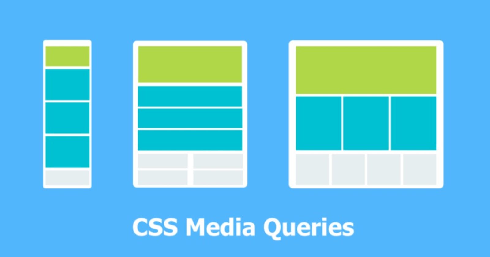
Media queries are an important aspect of modern web design. They allow you to apply different styles to a web page based on the characteristics of the device that is being used to view it. In this blog, we will discuss media queries and their properties in detail.
What are media queries?
Media queries are a feature in CSS (Cascading Style Sheets) that allow you to apply different styles to a web page based on the characteristics of the device or browser that is being used to view the page. Media queries enable you to create a responsive design that can adjust to different screen sizes, resolutions, and devices.
Media queries work by defining a set of CSS rules that apply only when certain conditions are met, such as the width of the viewport, the device orientation, or the screen resolution. You can use media queries to target specific devices or groups of devices, such as mobile phones, tablets, desktop computers, or large screens.
There are several types of media queries in CSS, each targeting a specific device characteristic. Here are some of the most common types of media queries and their examples:
Types of media queries:
1) Screen width
This type of media query targets the width of the viewport or the device screen. It's commonly used to create a responsive design that adjusts to different screen sizes. Example:
@media screen and (max-width: 768px) {
  /* Styles for screens with a width of 768px or less */
}
2) Device orientation
This type of media query targets the orientation of the device, either portrait or landscape. Example:
@media screen and (orientation: portrait) {
  /* Styles for devices in portrait mode */
}
3) Screen resolution
This type of media query targets the screen resolution of the device. It's commonly used to provide higher-quality images for devices with high-resolution screens. Example:
@media screen and (min-resolution: 2dppx) {
  /* Styles for devices with a screen resolution of 2dppx or higher */
}
4) Device type
This type of media query targets specific device types, such as handheld devices or printers. Example:
@media handheld {
  /* Styles for handheld devices */
}
5)Screen aspect ratio
This type of media query targets the aspect ratio of the screen, such as 16:9 or 4:3. Example:
@media screen and (aspect-ratio: 16/9) {
  /* Styles for screens with a 16:9 aspect ratio */
}
6) Device Width and Device-Height
The device-width and device-height properties specify the width and height of the device screen, respectively.
@media screen and (min-device-width: 320px) and (max-device-width: 480px) { /* CSS styles go here */ }
In this example, the styles will be applied to devices that have a screen width between 320 pixels and 480 pixels.
7)Device-Pixel-Ratio
The device-pixel-ratio property specifies the ratio between physical pixels and device-independent pixels (DIPs) on a device.
@media screen and (min-device-pixel-ratio: 2) { /* CSS styles go here */ }
In this example, the styles will be applied to devices that have a pixel ratio of at least
8) Grid
The grid property specifies whether the device supports a grid-based layout system.
@media (grid) { /* CSS styles go here */ }
In this example, the styles will be applied to devices that support grid-based layout systems.
9)Pointer
The pointer property specifies the type of pointing device that the user is using.
@media (pointer: coarse) { /* CSS styles go here */ }
In this example, the styles will be applied to devices that use a coarse pointing device, such as a finger.
10) Hover
The hover property specifies whether the device supports hover effects.
@media (hover: hover) { /* CSS styles go here */ }
In this example, the styles will be applied to devices that support hover effects, such as desktop computers with a mouse.
These are just a few examples of the types of media queries you can use in CSS. By using media queries, you can create a responsive design that adapts to different devices and screen sizes, providing a better user experience for your website visitors.
Thanks for reading!
If you found this article helpful, please like and share it, Thank you😊
You can connect with me on Linkedin.
